The Return of Bold Type: Why Maximalist Typography Is Dominating 2026
Oversized headlines, expressive variable fonts, and type-as-image are reshaping brand identities. Here's how to use bold typography without losing clarity.
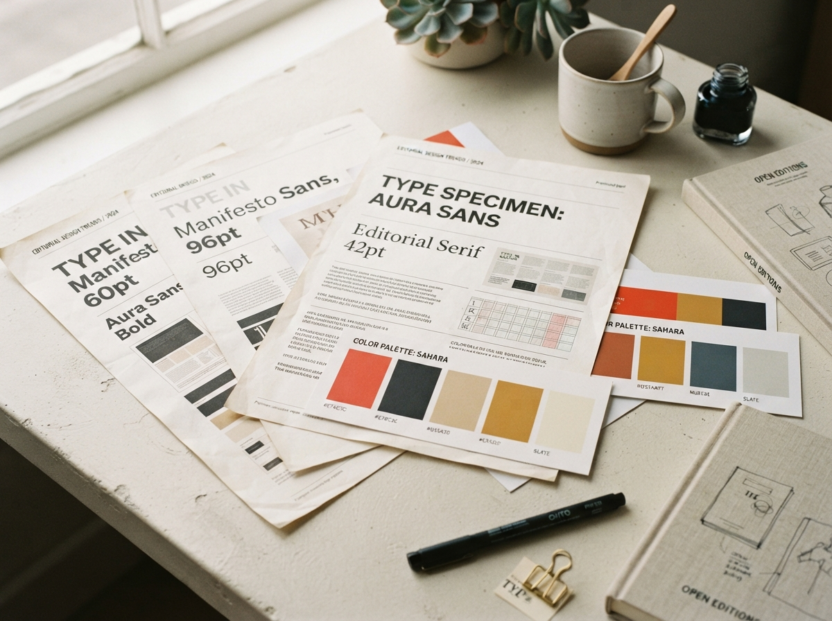
Typography has quietly become the loudest voice in brand identity. Across the studios, campaigns, and digital products we study every week, one pattern keeps repeating: type is no longer a supporting element — it is the design.
From invisible to unforgettable
For a decade, minimalism taught us to whisper. Clean grotesques, generous whitespace, restrained hierarchies. But audiences have adapted to whispers, and adaptation is the enemy of attention. Brands that want to be remembered are learning to speak again — with oversized headlines that bleed off the canvas, variable fonts that respond to scroll position, and letterforms treated as photographic subjects.
Three moves defining the trend
1. Type as hero image. The headline isn’t captioning the visual anymore; it’s competing with it. When a wordmark carries the entire composition, every curve and counter carries meaning.
2. Kinetic letterforms. Variable font axes let weight, width, and slant respond to interaction. A headline that breathes as you scroll reads as alive — and alive reads as premium.
3. Editorial contrast. Pairing an expressive display face with a neutral workhorse creates tension. Tension holds the eye. The trick is restraint on one side of the pairing: let one face perform, let the other serve.
How to use it well
Bold type fails when it’s decoration. It works when the typography encodes the brand’s personality — its tempo, its confidence, its sense of humor. Before you scale that headline to 200px, ask what the size is saying. If the answer is “we’re unafraid,” you’re on the right track.
At KINETIK, we start every identity project with a typographic voice exercise: three words that describe how the brand sounds on the page. Everything downstream — weight, spacing, scale, motion — flows from that answer.
Want typography with something to say? Start a project with us.